Goldman Sachs 2024
Publicis Sapient's goal is to launch a new digital brand identity for the corporate website, create a seamless and engaging user experience incorporating the latest technologies and industry best practices. For me, it was an opportunity to help set a high benchmark: provide a fresh, friendly experience that is easy-to-use and set a high bar across the financial services industry.
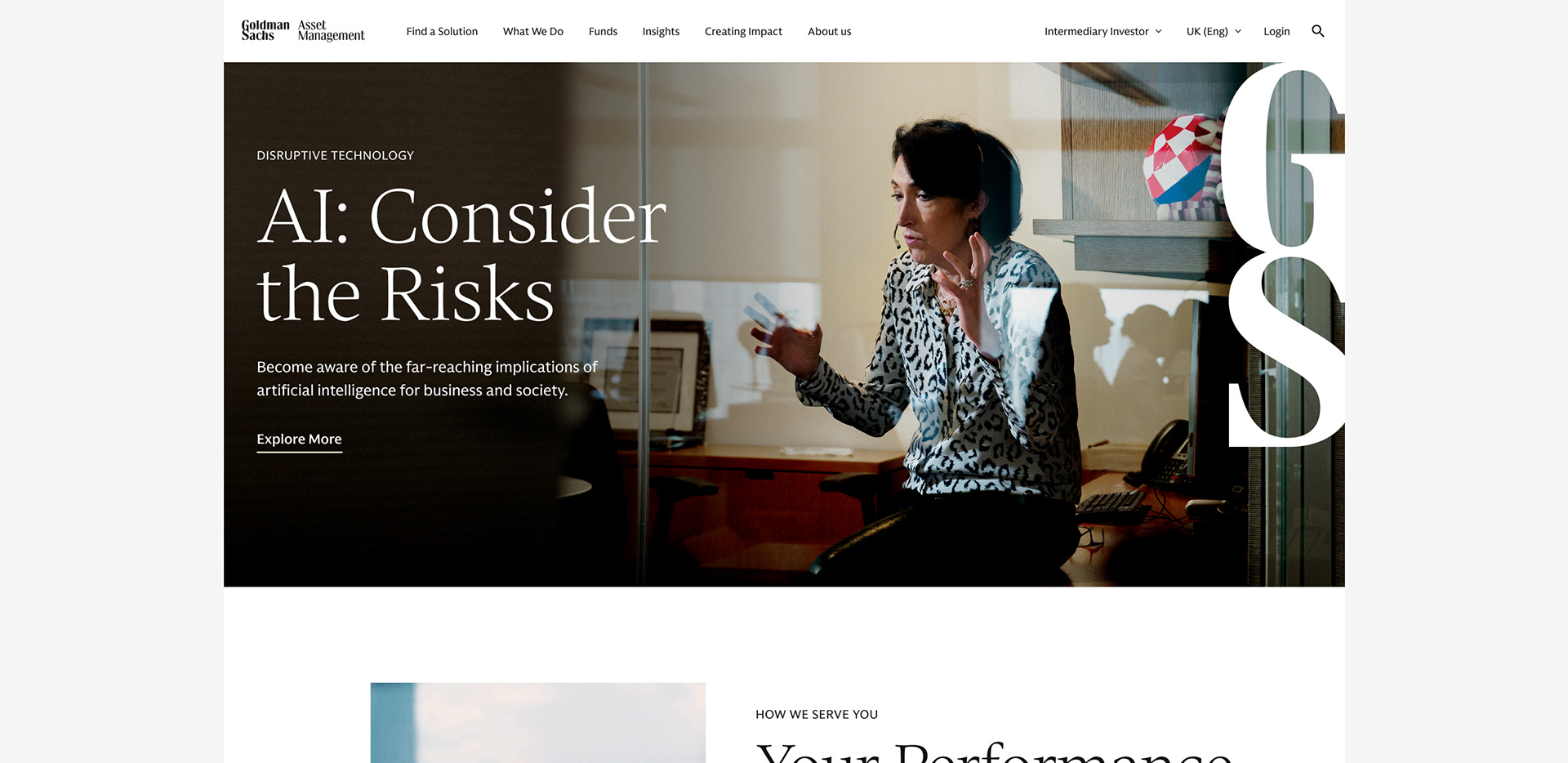
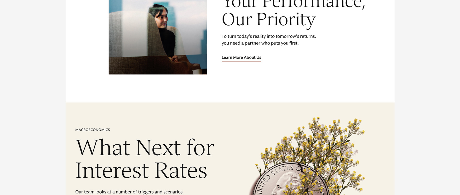
GoldmanSachs.com has 20MM unique visitors annually with all sorts of needs. We were tasked to design an intuitive and visually compelling interface, that aligns to the new visual identity, assess the toolkit gaps and create new components that meet the evolving needs of users.
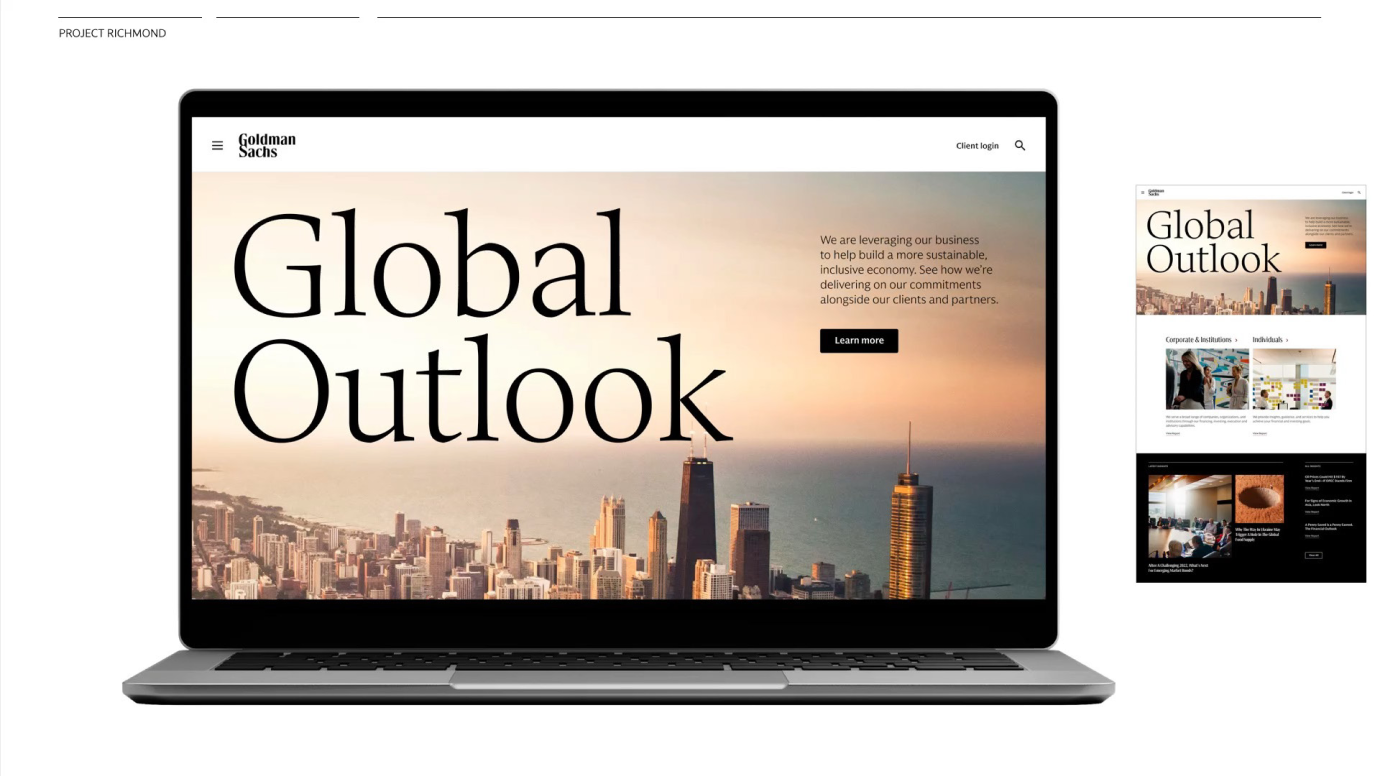

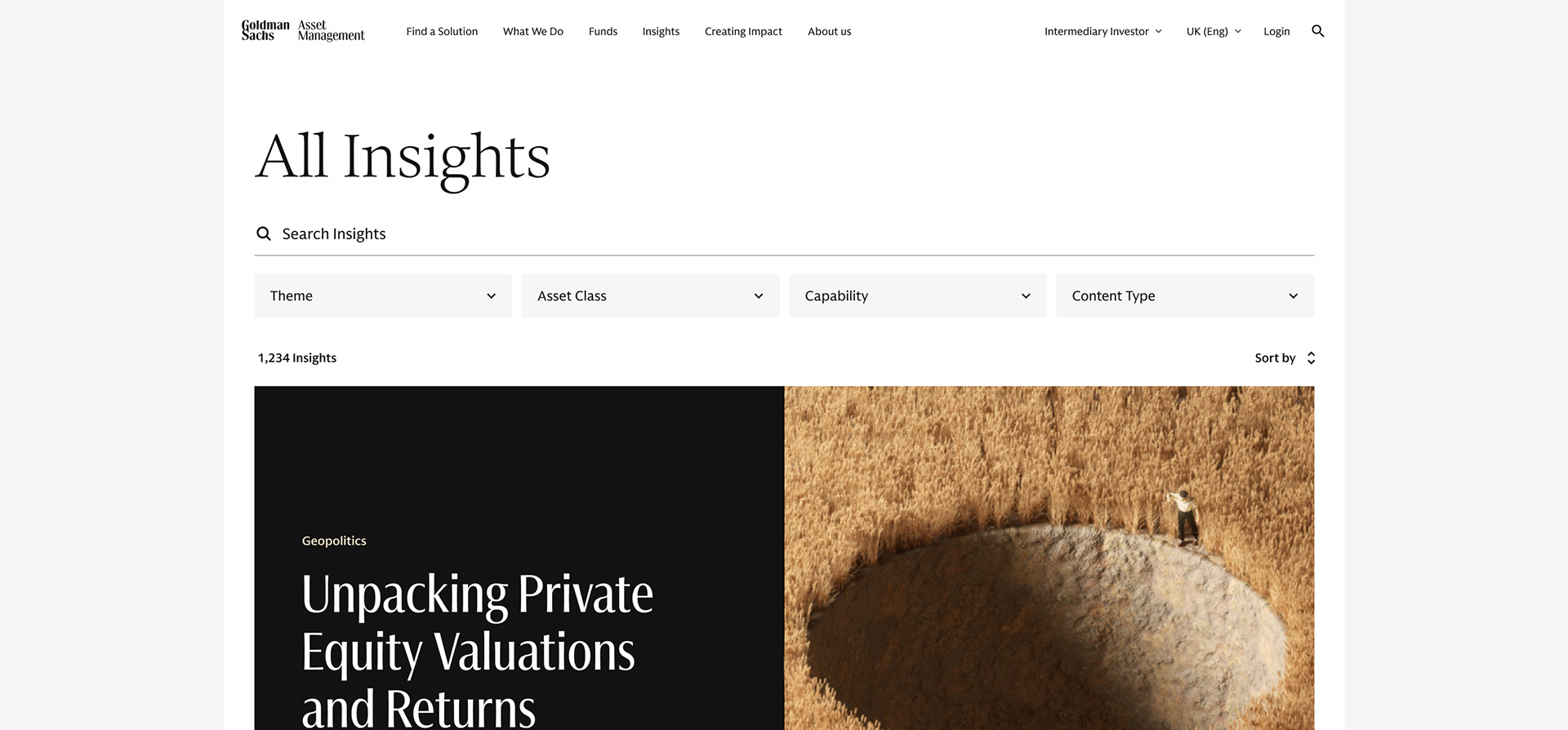
A destination for useful, relevant intelligence
To create a frictionless experience that audiences can navigate with ease, organization and presentation of vast quantities of thoughtful content needed to be searchable and scaleable.
Publicis Sapient research suggested that primary audiences visiting and engaging with the Goldman Sachs site through these mindsets:
General Information Seekers
"I want to understand what Goldman Sachs is about and what they offer."
"I want to understand what Goldman Sachs is about and what they offer."
Informed researchers
"I want to leverage Goldman Sachs thought leadership and expertise on a particular subject."
"I want to leverage Goldman Sachs thought leadership and expertise on a particular subject."
Task Completers
"I want to take an action and am looking for a specific piece of information to help make a key decision."
"I want to take an action and am looking for a specific piece of information to help make a key decision."
From these primary audiences we needed to provide pathways for job seekers, the largest category of users on the site, clear content to consume and actions to perform.

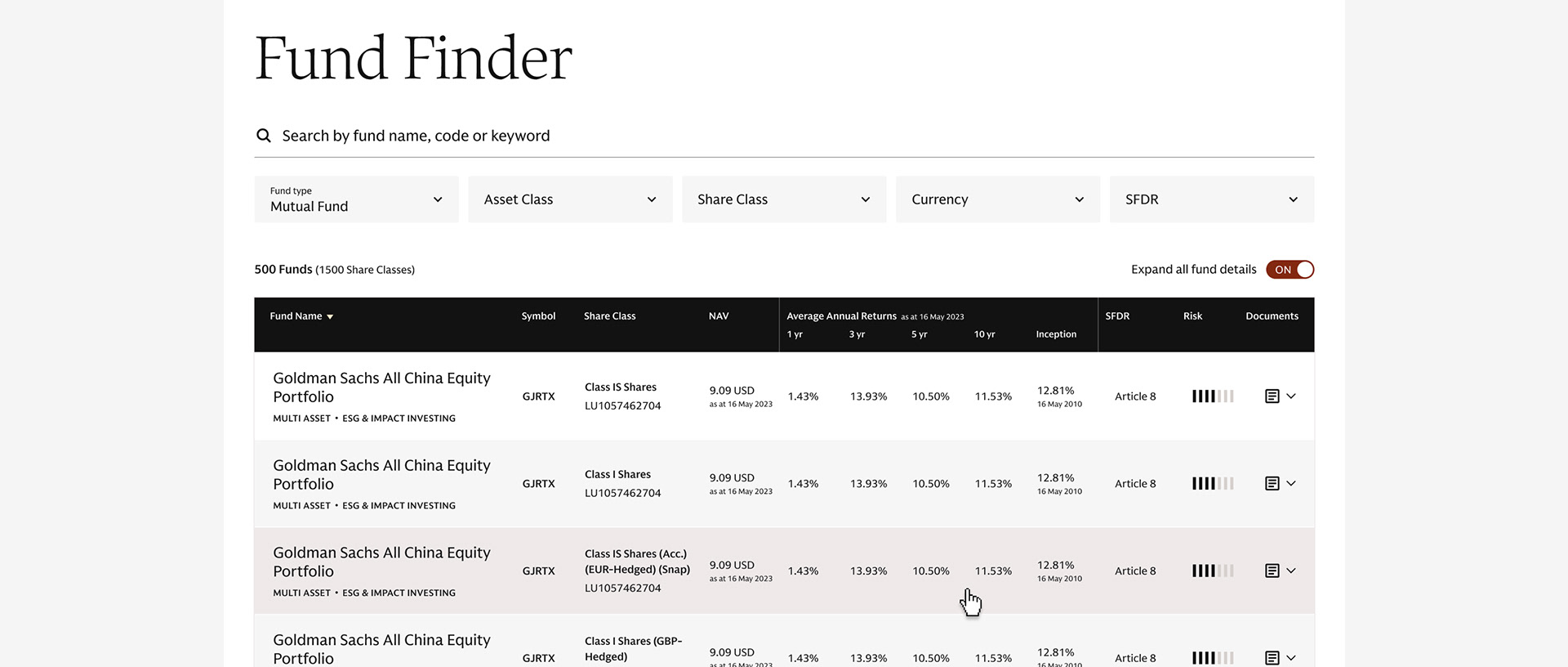
In tandem to the design there was an audit done to help define Tier 1, Tier 2, and Tier 3 pages and create new and update legacy content & pages.Publicis Sapient needed to improve the back-end infrastructure with Adobe CMS, new search solutions and performance enhancements.
Tier 1
For these high priority sections, user goals and strategy help define the optimal experience for these pages.
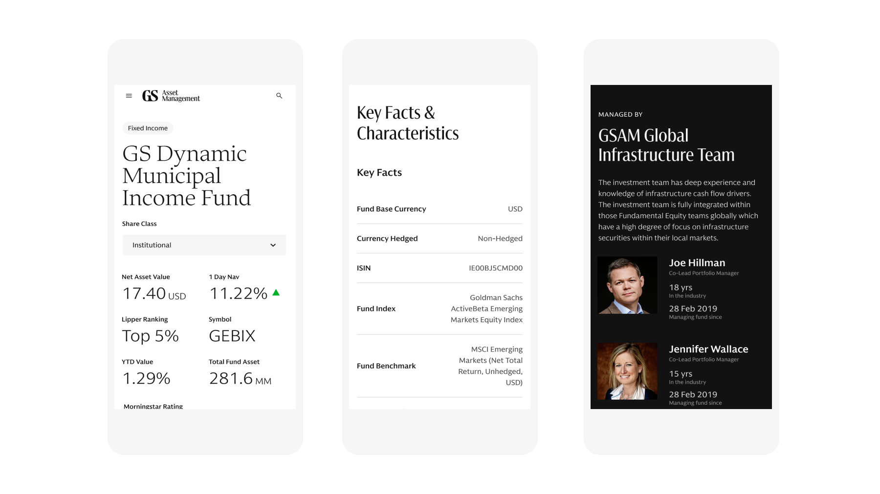
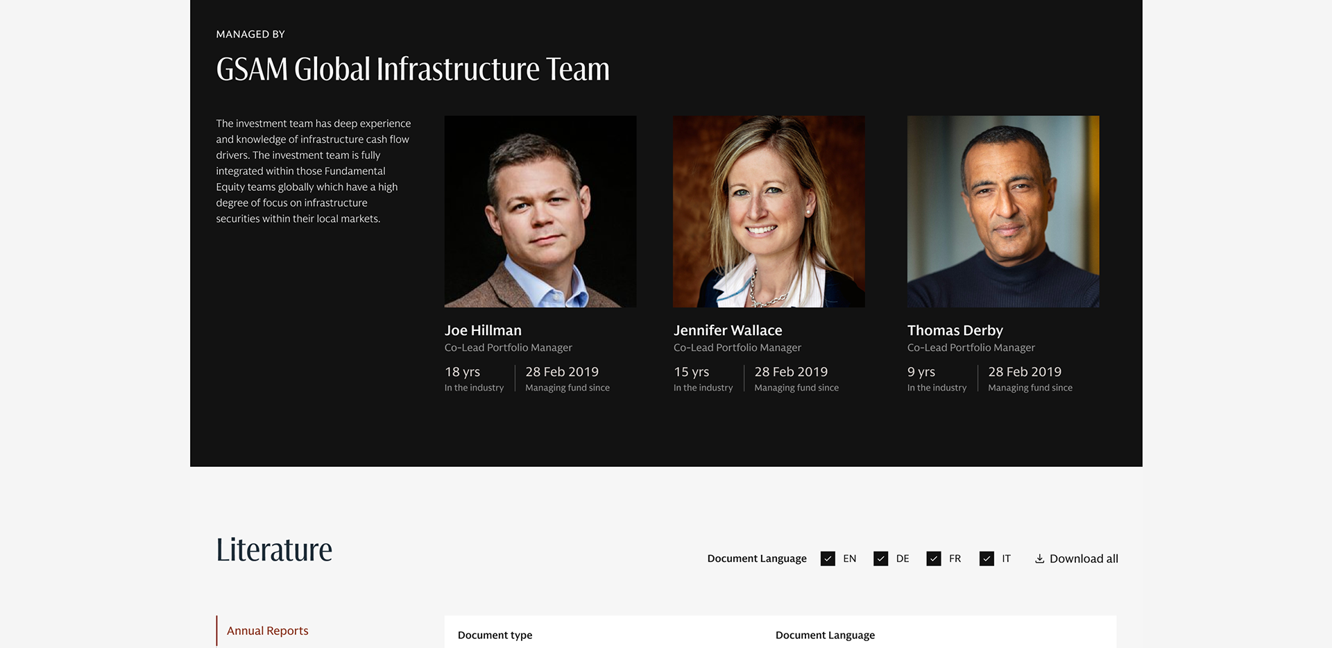
The team leverages Figma components made in this process but we also identify areas that could use custom components best designed to address specialized needs. This balance helps bring a differentiated experience.
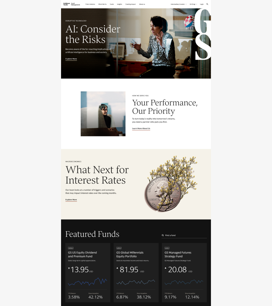
Main page
Tier 2
Nearly all of the content from the previous site was migrated over into the new design system. Tier 2 sections have the distinct purposes and communications goals like Corporate pages and Careers subpages utilized sustainable components.
There are outliers in Tier 2 that have a distinct experiences—similar to micro sites. These needed to align to the design system and resolved usability and accessibility issues with the old platform.
Tier 3
2,500 pages, reduced from 4k, were immediately migrated to the new platform and were reskinned to align to the main GS brand. From a design perspective, little was done in this area since the majority of components were created for Tier 1 and 2.
Imperatives for Success
Insightful
Ultimately we were building on existing knowledge and research gathered across completed and ongoing Goldman Sachs projects to create all these insights around what matters to their audience.
Ultimately we were building on existing knowledge and research gathered across completed and ongoing Goldman Sachs projects to create all these insights around what matters to their audience.
Findable
We needed to ensure relevant content is discoverable and navigable—things needed to be found organically.
We needed to ensure relevant content is discoverable and navigable—things needed to be found organically.