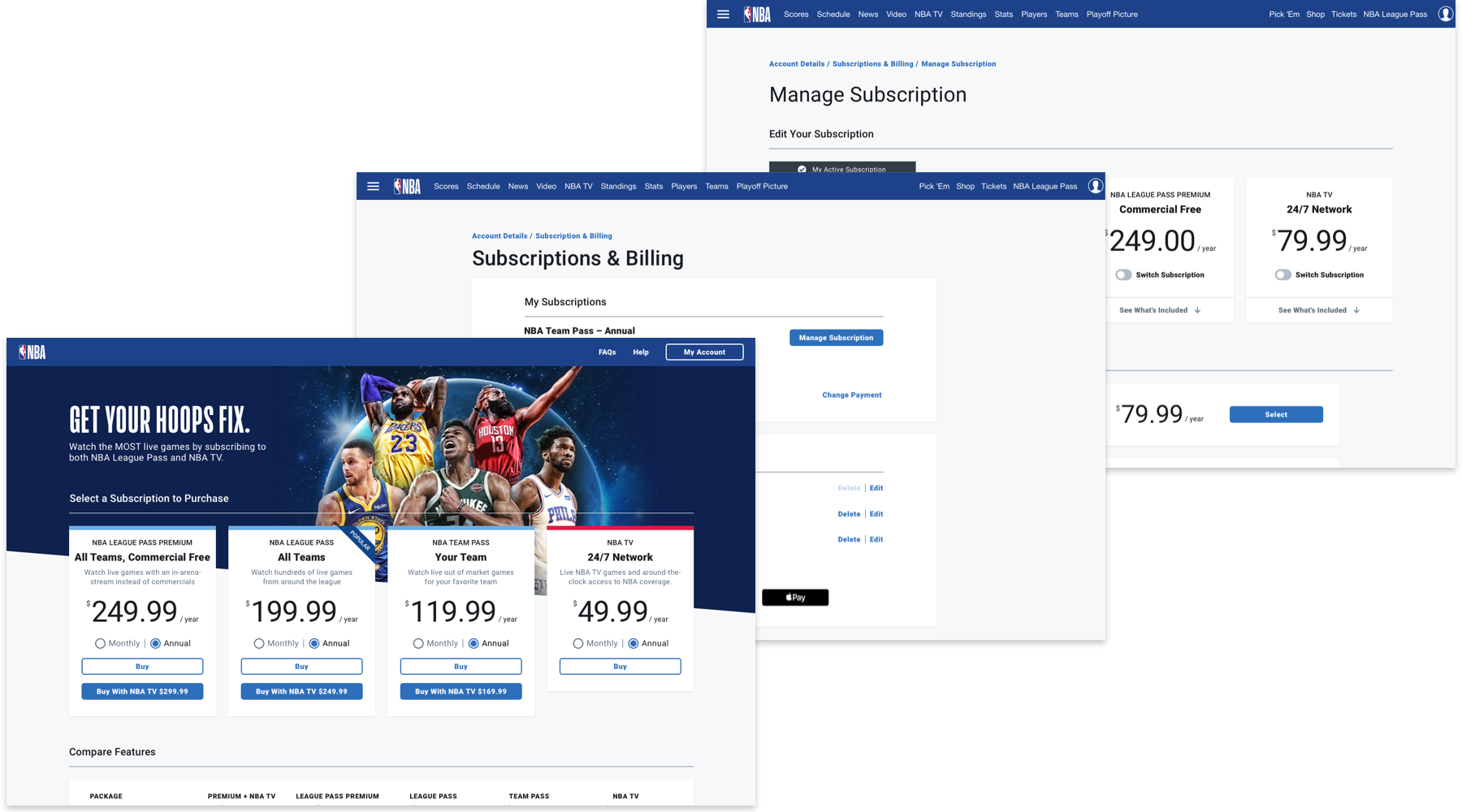
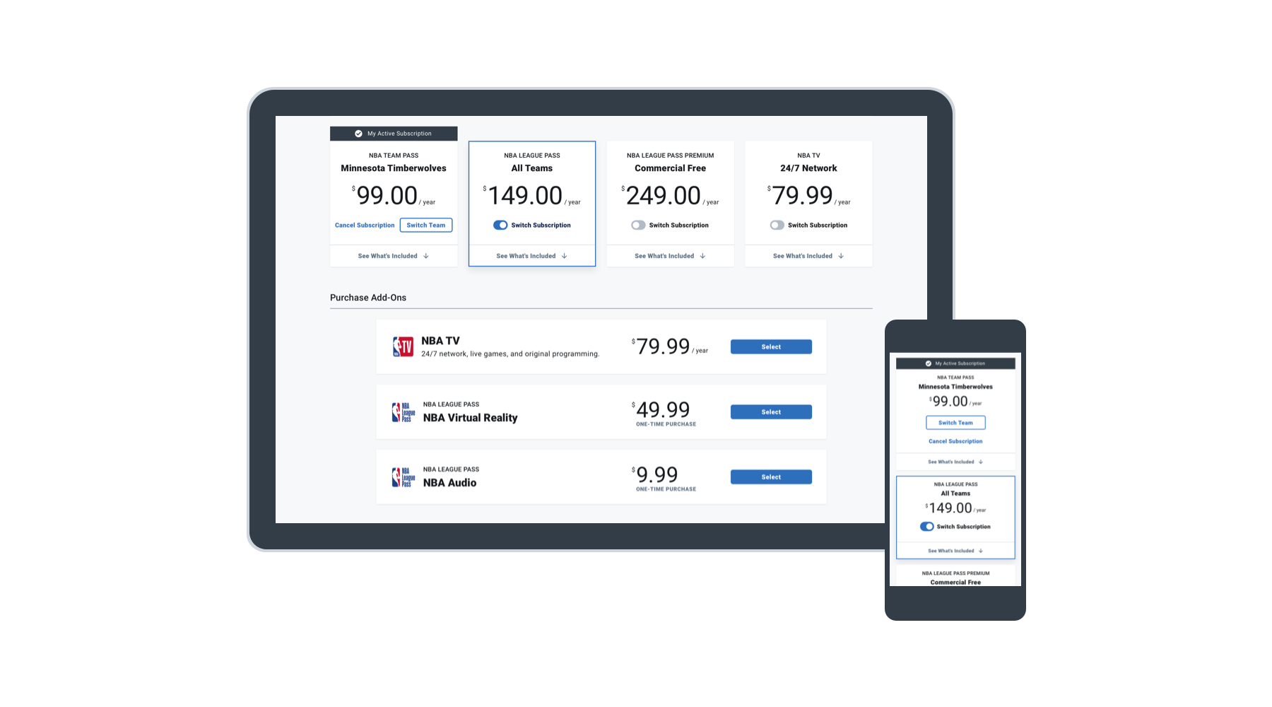
NBA Storefront
NBA Digital is the group responsible for the creation and maintenance of all tools used throughout the nba.com experience. As product lead, I collaborated with a visual designer and ux designer, a product manager, and a large group of developers on a new flow for managing subscriptions. This was labeled internally as Storefront and became a top business priority.
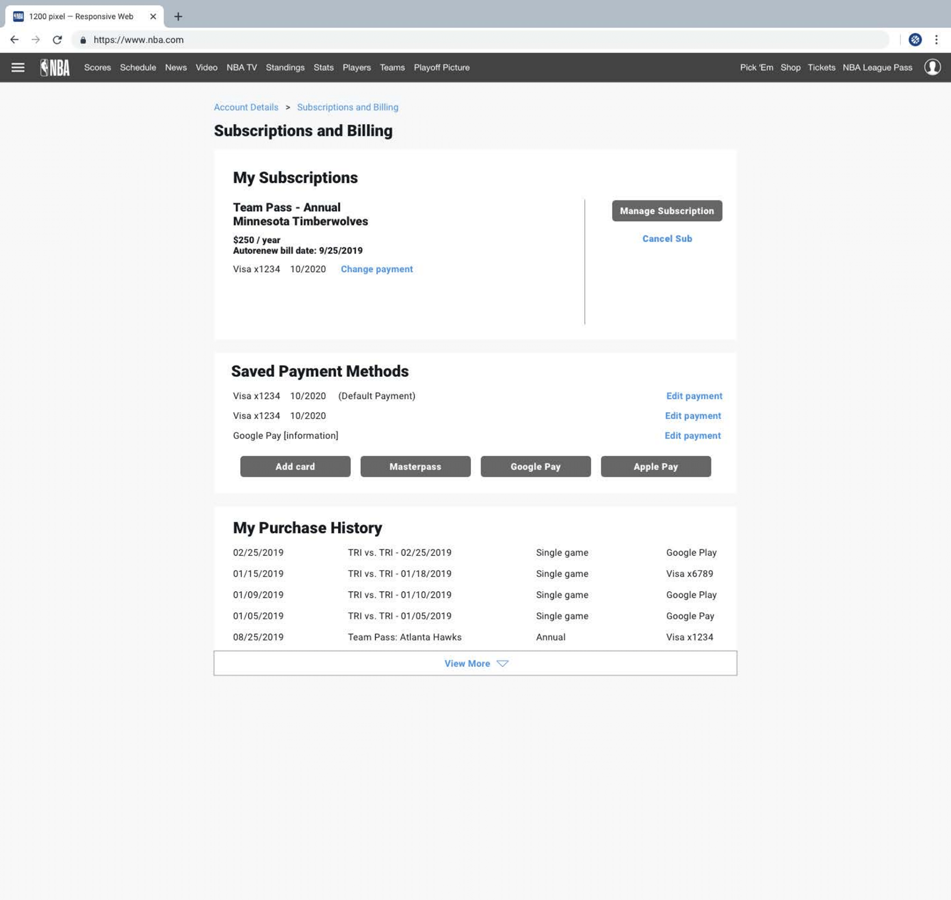
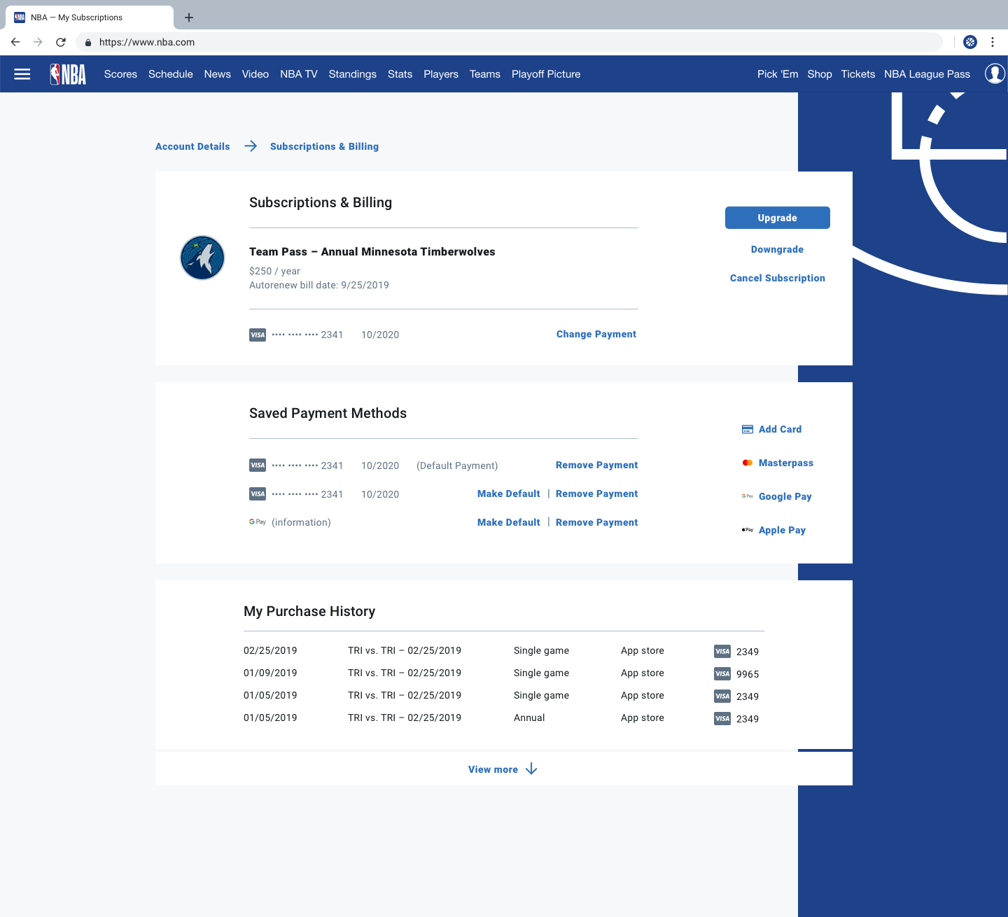
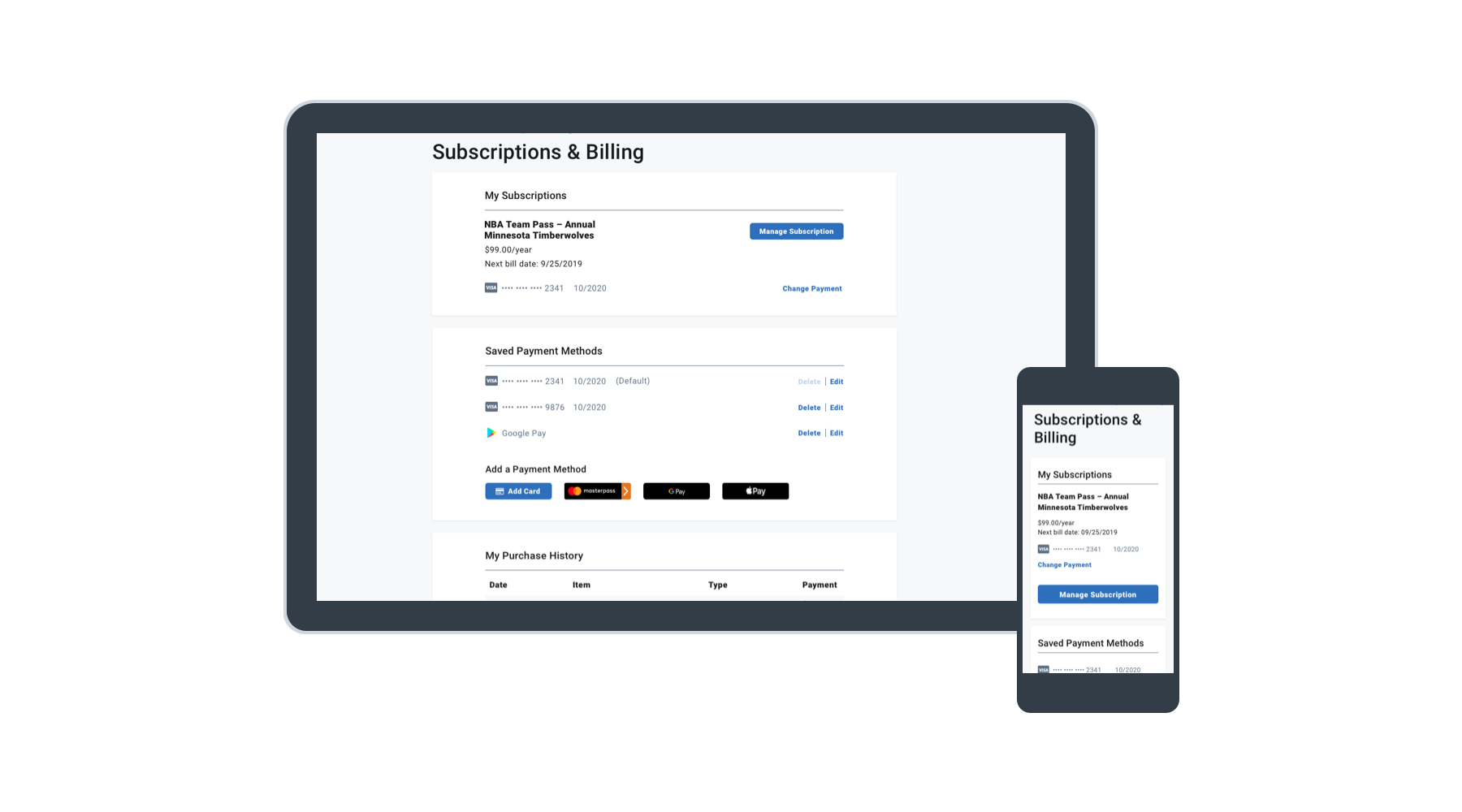
Our mandate was to simplify/update the old system and to create a more streamlined and transparent flow. The intent was to keep the front end simple while also supporting a flexible payment system that would allow us to scale the NBA business.
Product Design Lead: design system, UX
Our four-person design team was tight-knit and highly collaborative. The others on my team were Liz, who was responsible for all of the research that was gathered and some user flows, and Alejandra, who was project lead in addition to handling the information architecture with development.
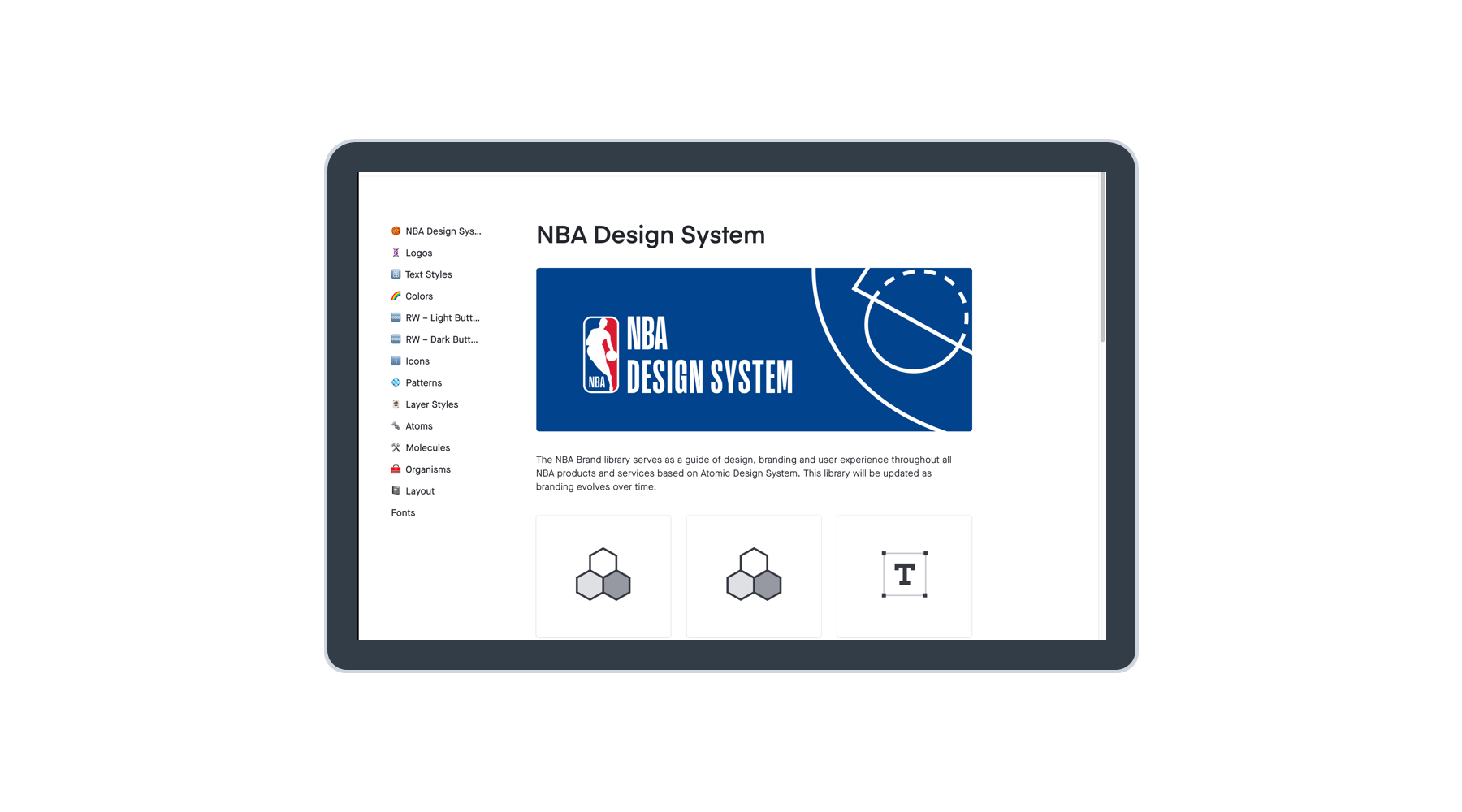
I was responsible for collaborating with Liz at the wireframe stage and then bringing those designs to life. My role included visual design, micro-interactions, and in tandem, the creation of our NBA Digital style guide to better leverage the work we were doing on this product across other verticals.
I worked on gaining visibility into other design efforts to ensure we weren’t being duplicative with our components – this yielded lots of opportunities for collaborations between teams that might not have otherwise.
With a little help from my friends
When we first started the project, we had little to go on in the way of design direction. I was already working on the infant stages of our design system.
Search (and research) your feelings
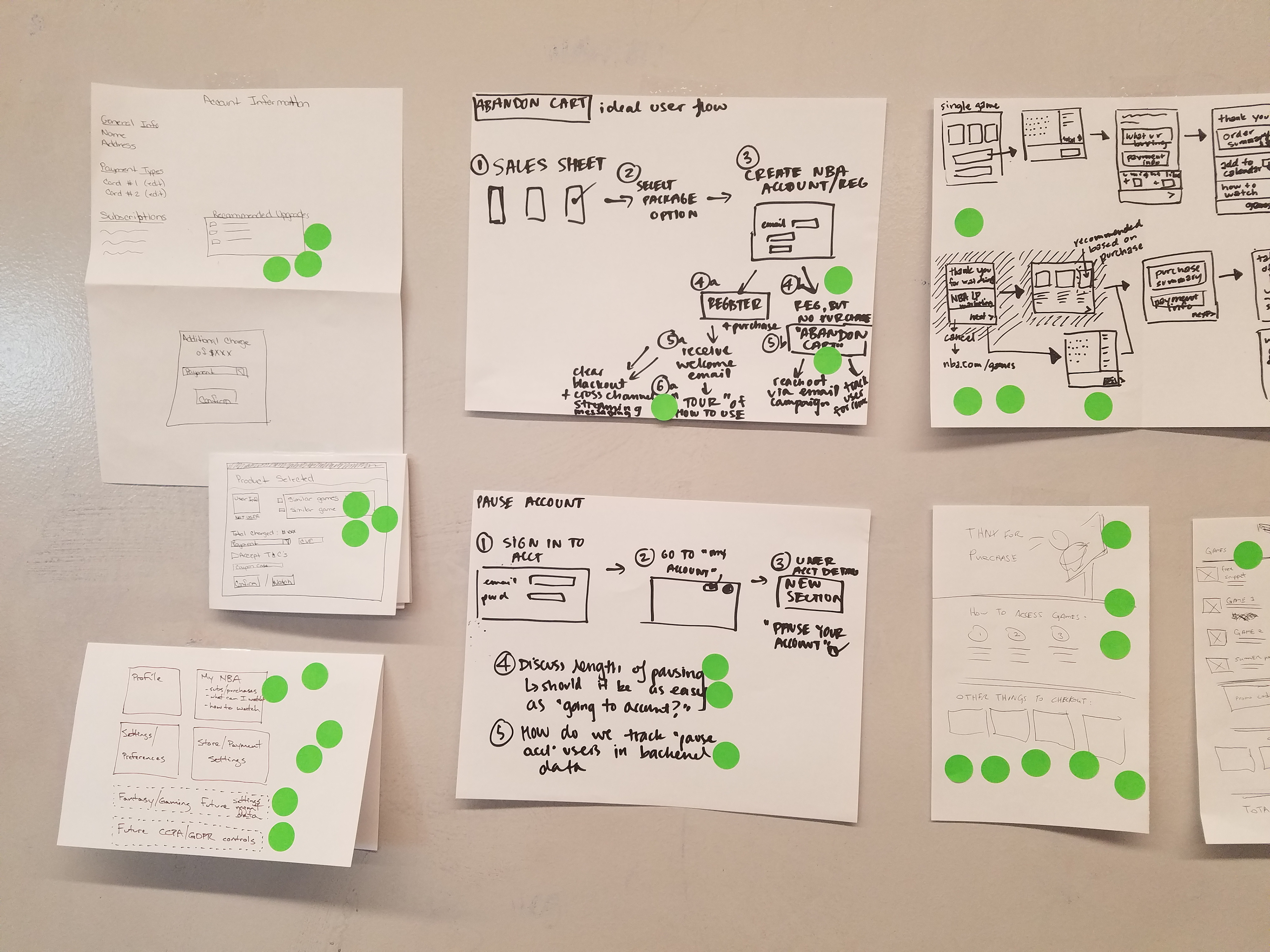
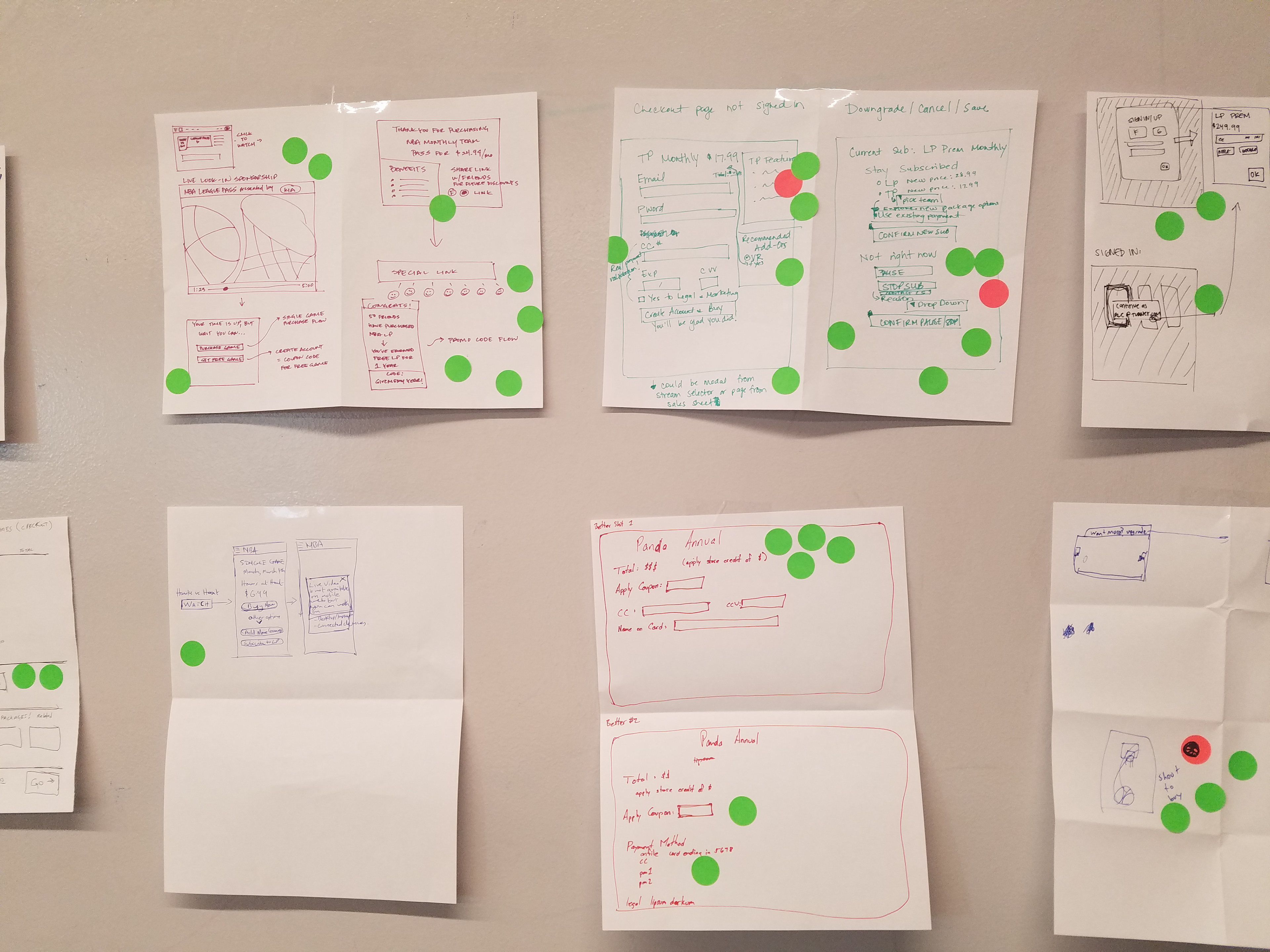
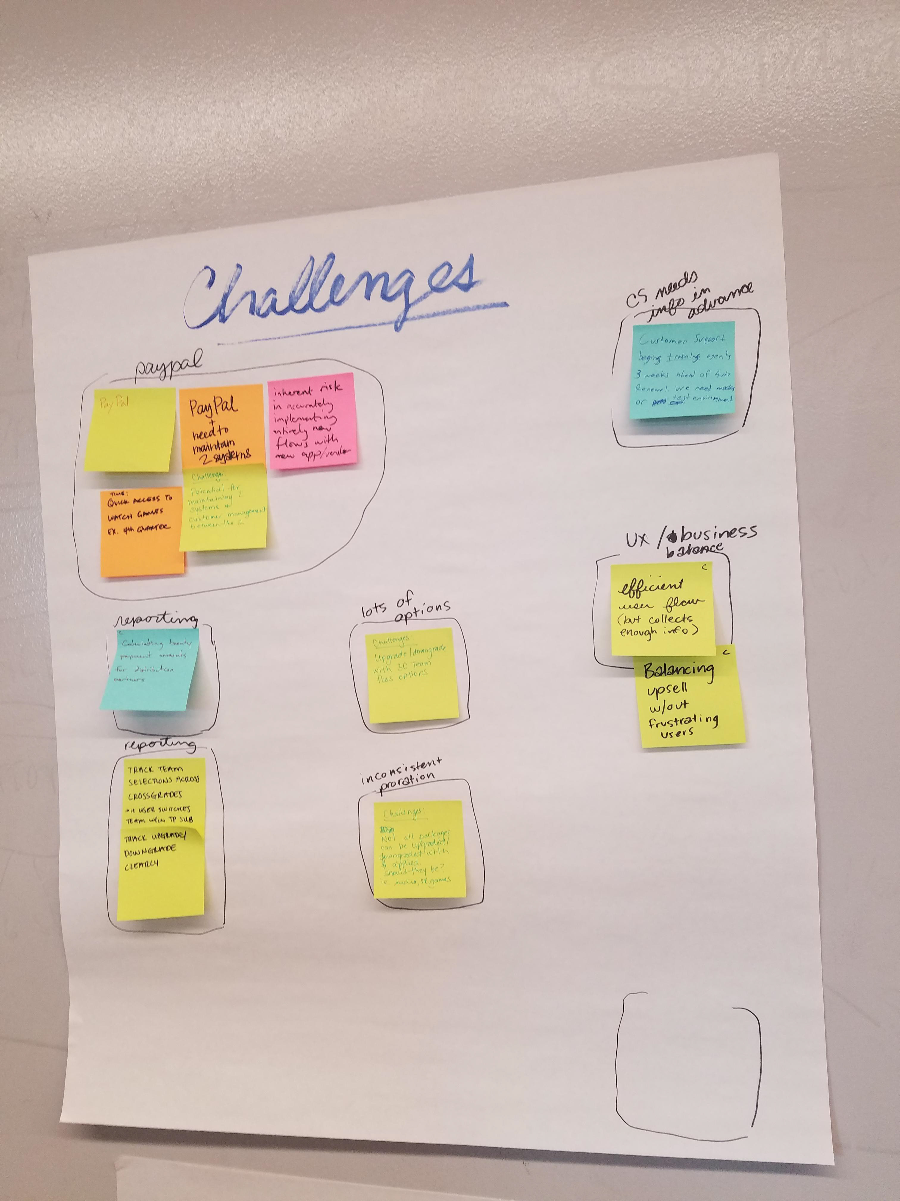
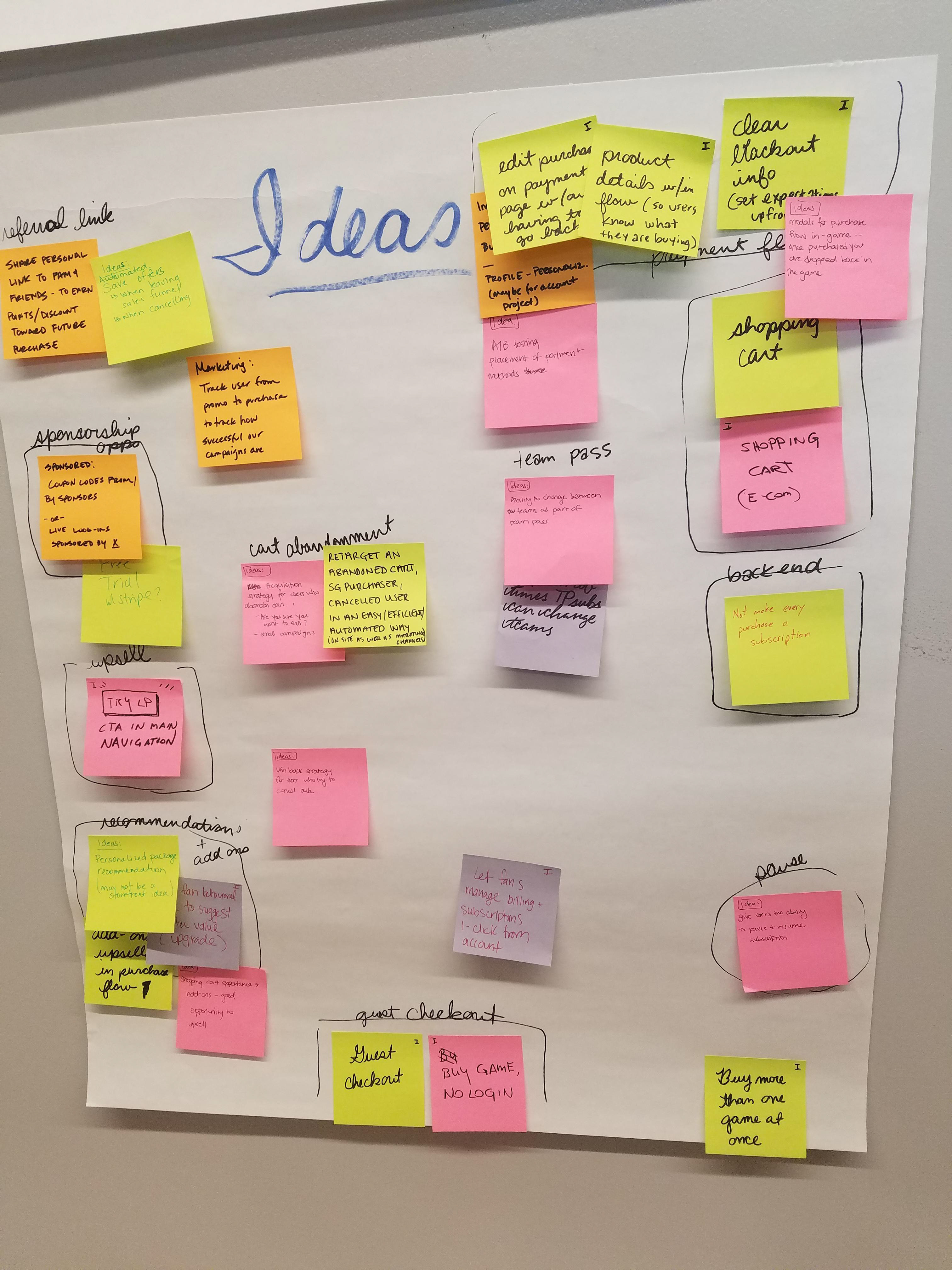
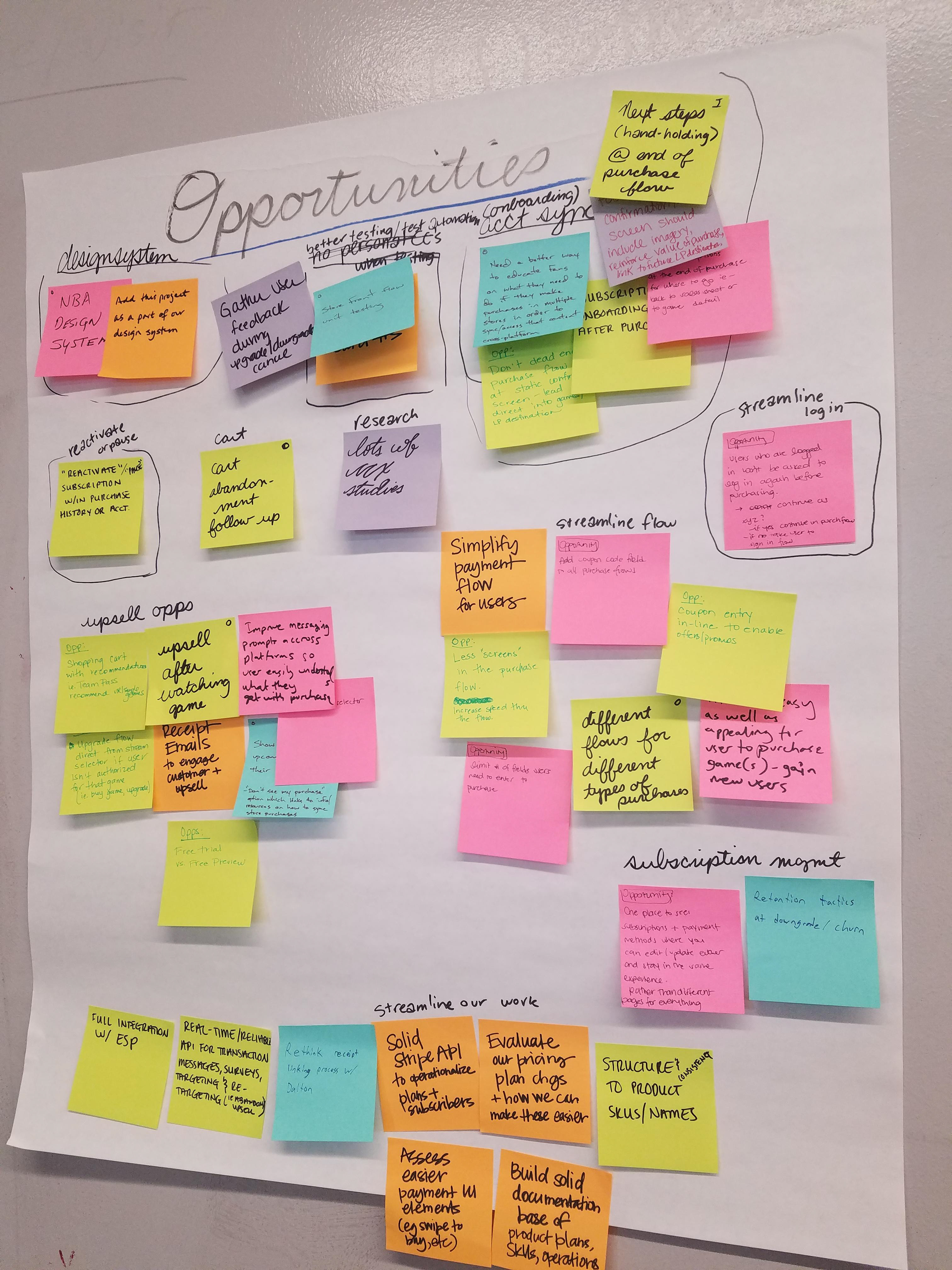
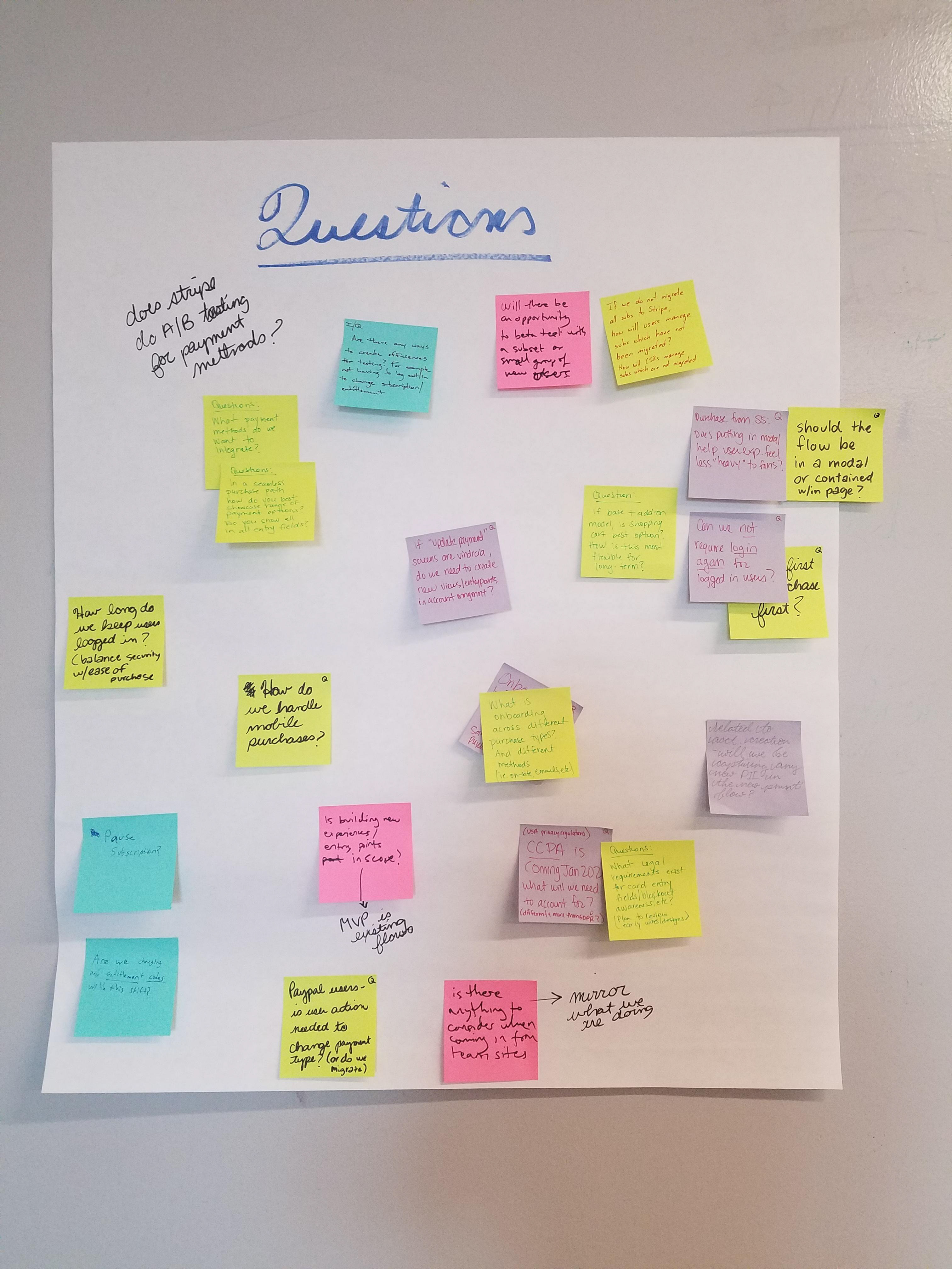
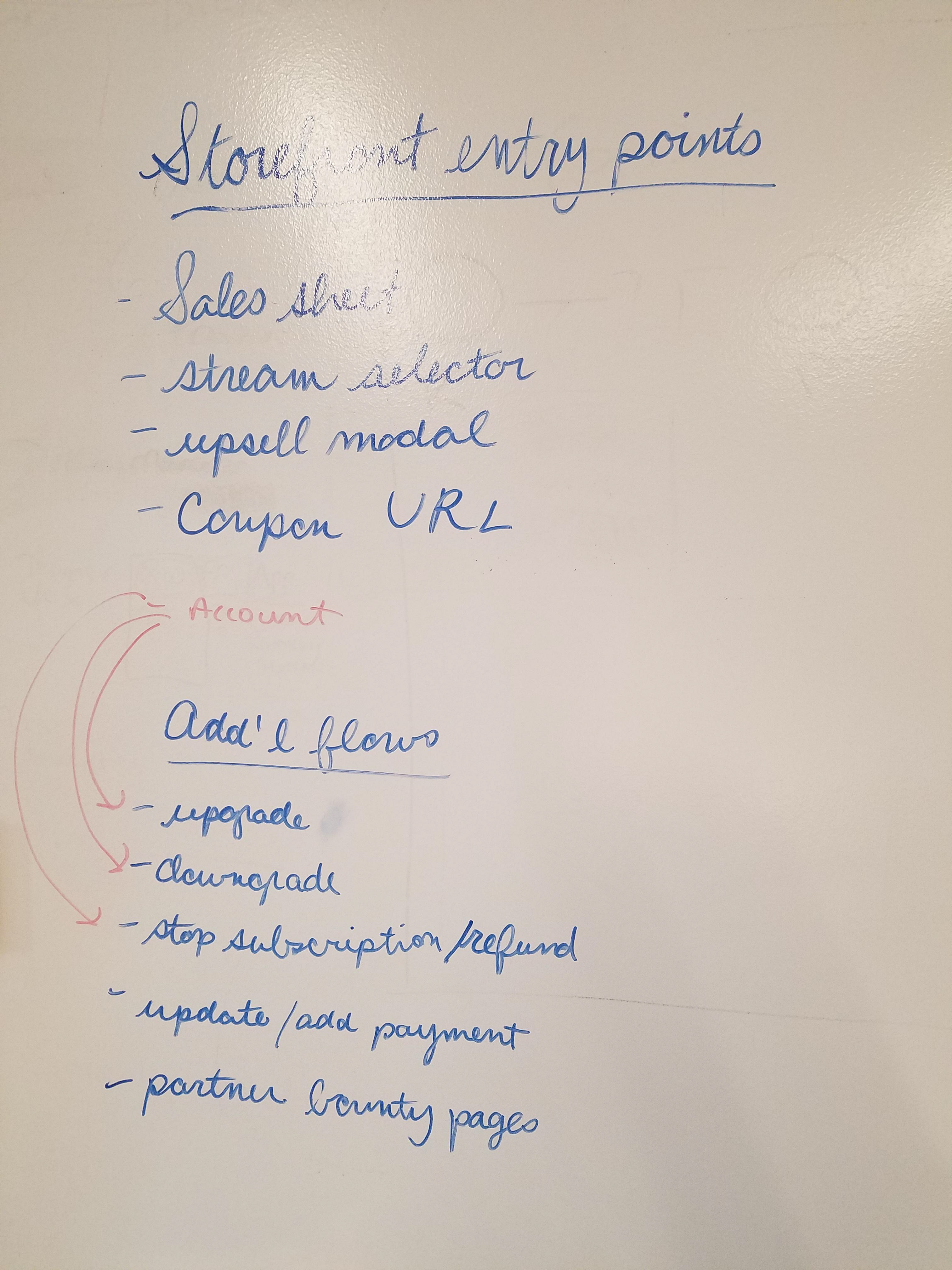
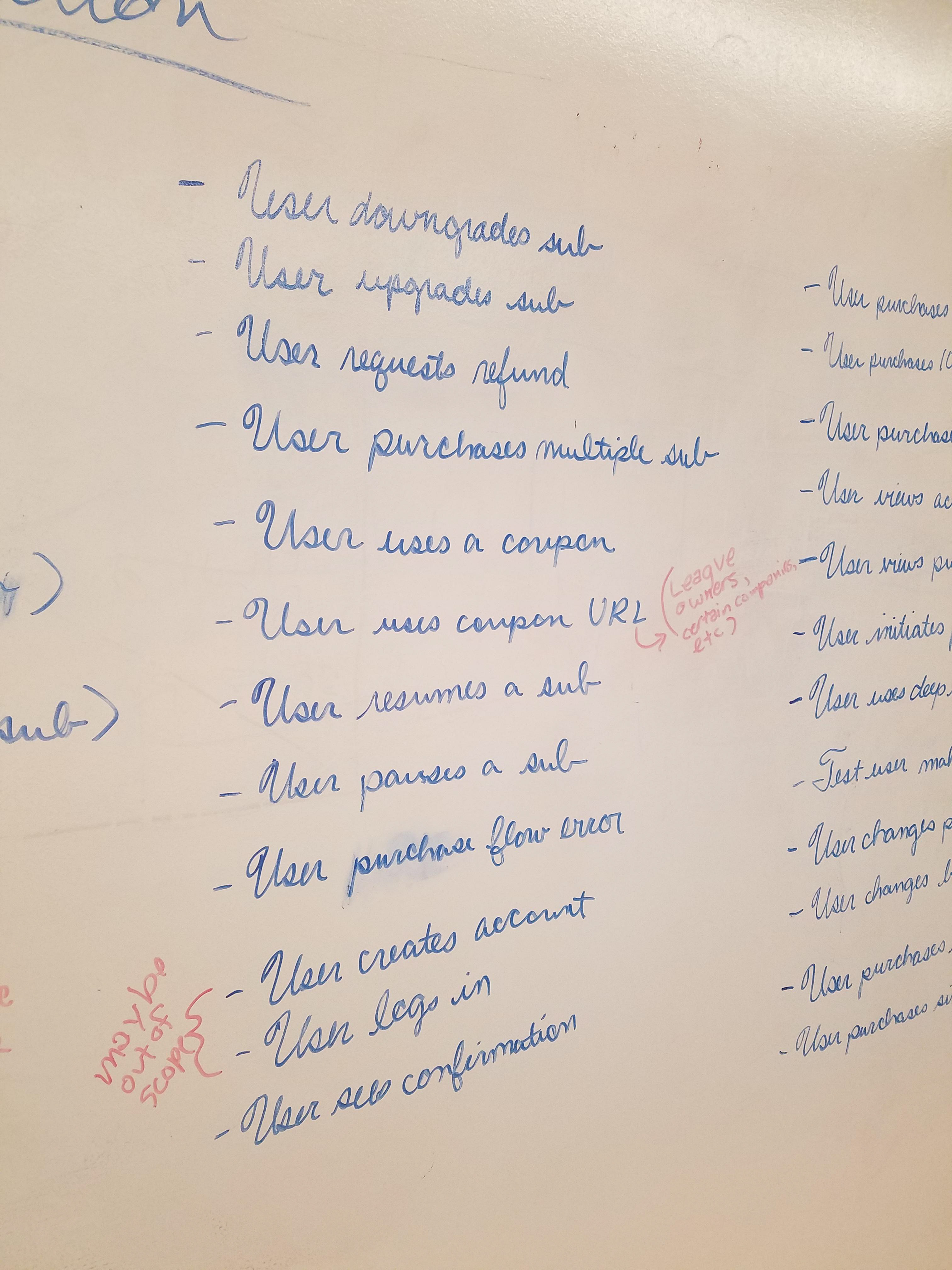
Good design doesn’t happen in a vacuum. We had some project goals and set up some brainstorming sessions with everyone: analytics, development, marketing on what would be best in class and how other places handle subscription services. In a perfect world, what is the coolest thing we can do?
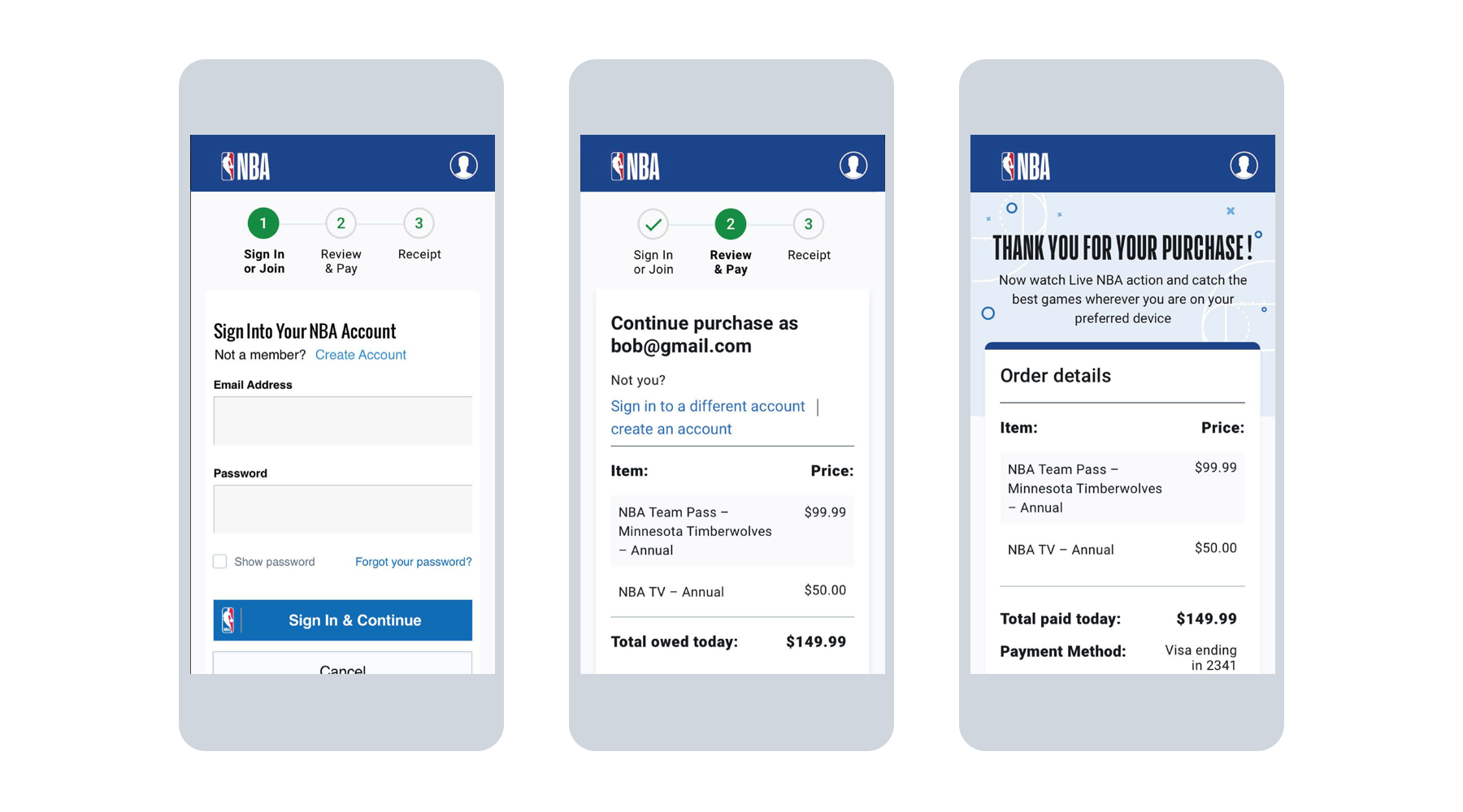
We realized that for all of our ideas, what we thought of our work ultimately didn’t matter. Our user research Kacey ran tests as a way of validating our hypotheses in a way that had no confirmation bias on our part, so that we could design as faithfully as possible for our users
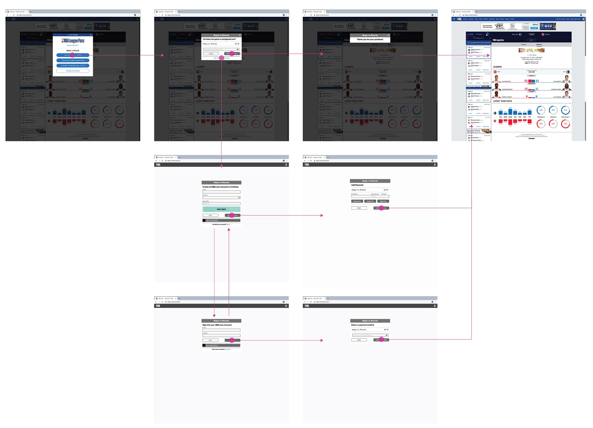
With our research process in place, and our engineering team in dire need of new design work, we set out to carry out the work we had painstakingly laid the foundation for.
We used the one week sprint for design. Though this might seem restrictive, it prevented us from getting too far into conceptual work, instead keeping us securely in the realm of pragmatism.
The Big Reveal
The need for a design system
While work on the product continued, I continued my other, more ethereal project, I gathered all of the patterns we had created for Storefront and put them into one place, while also creating a grid system, type hierarchy, etc.
Since there was no guidance around any design patterns, I used a lot of Storefront assets as a stepping stone for scalable components in other products on the XD team. For more on that, check out the NBA Design System.